During class the other day we went into a card shop, as one does. In said card shop, I found the poster below. As a Parisian native who also lived in NYC, and an urban planner to boot, I have feelings about this poster.
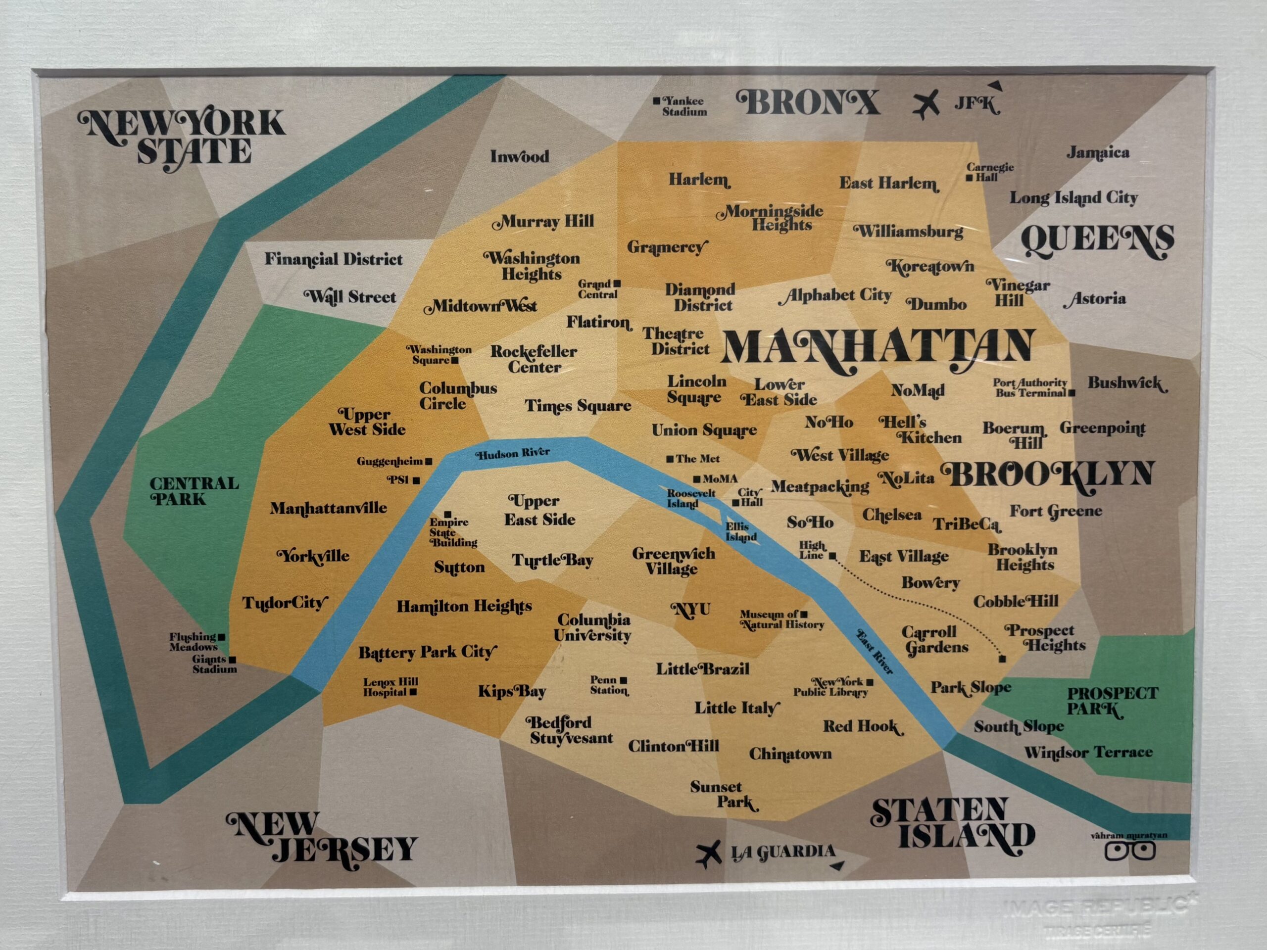
OK, really my first thought was a whole-body shudder. And once I got over myself, I tried to be more thoughtful.
Geographically, Paris and NYC are completely different. Their histories are completely different. Their timelines are completely different. BUT. Some of the parallels are acceptable, I guess.
- Orly/LaGuardia and CDG/JFK makes sense-ish. Although what about Newark? I guess there’s no Newark in this scenario?
- Central Park/Bois de Boulogne and Prospect Park/Bois de Vincennes again sorta makes sense, though that ignores places like the Luxembourg altogether which ??!!?!?
- Some of the neighborhood parallels are again not too bad. If you look at demographics, then yes, the 16ème is like the Upper East Side. It skews bougie, conservative, and older. And having Chinatown in the 13ème again makes sense, as it’s a strong Vietnamese community.
- The museum comparisons are likewise mostly acceptable, though some like Orsay are completely ignored. And some single landmarks are easy one-to-one matches like the Bibliothèque Nationale de France (BnF) and the 42nd Street Library. Similarly, the High Line was actually modeled on the Coulée Verte, so that one is a fair comparison.
But while some of these specific points kind-of sort-of fit, I still can’t get over how jarring this entire comparison feels. As soon as you start thinking about any specific comparison, you realize there are lots of ways in which it just isn’t right. Maybe if the map had just removed the boroughs entirely, it would work better? Because as it is many neighborhoods from one borough are represented in Paris in another. Plus NYC is famously very particular about its neighborhoods and their edges. Yet this map takes neighborhoods willy nilly. For instance, the Upper East Side is represented in the 7ème but Yorkville – which is part of the Upper East Side – in the 16ème. Meanwhile Manhattanville – shown here abutting Yorkville – is on the Upper West Side all the way across the park, and with a very very different vibe to boot.
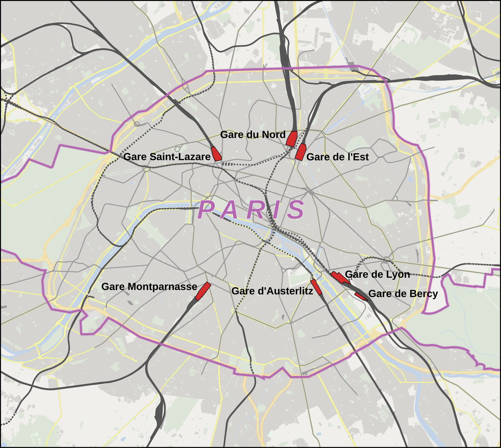
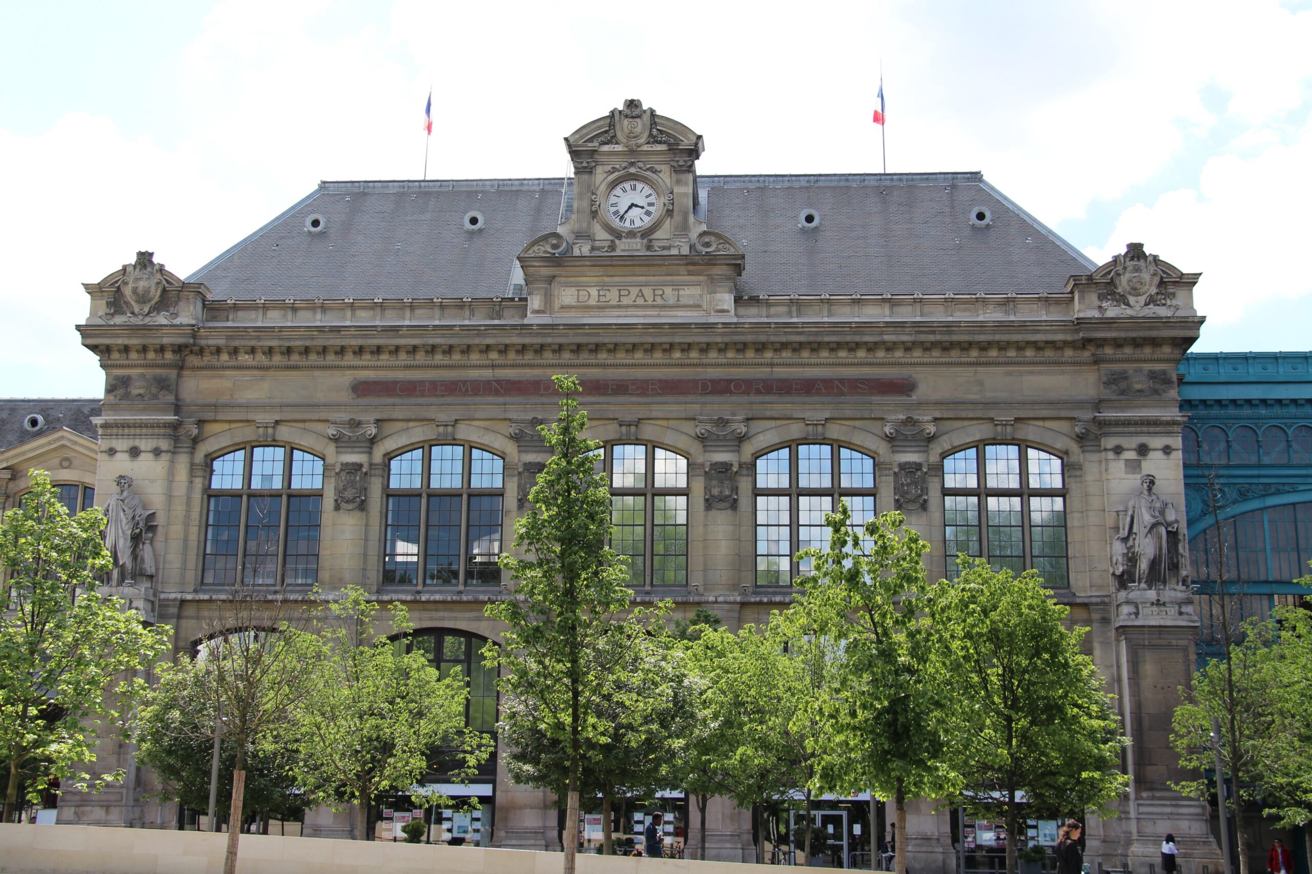
And then, there’s the train stations. Only two are shown presumably since NYC only has two: Montparnasse as Penn Station and Grand Central as St Lazare. But what about all the others? Paris is very much NOT a city of two stations but a city of many, and each one not only serves different destinations but has very different characteristics.

Which finally brings me to the islands. The islands make me unreasonably* angry. The Île de la Cité is the very heart of Paris and has been for its entire history. I’ve never even set foot on Roosevelt Island, which was mostly closed to the public until the 1970s when it was developed for residential use.
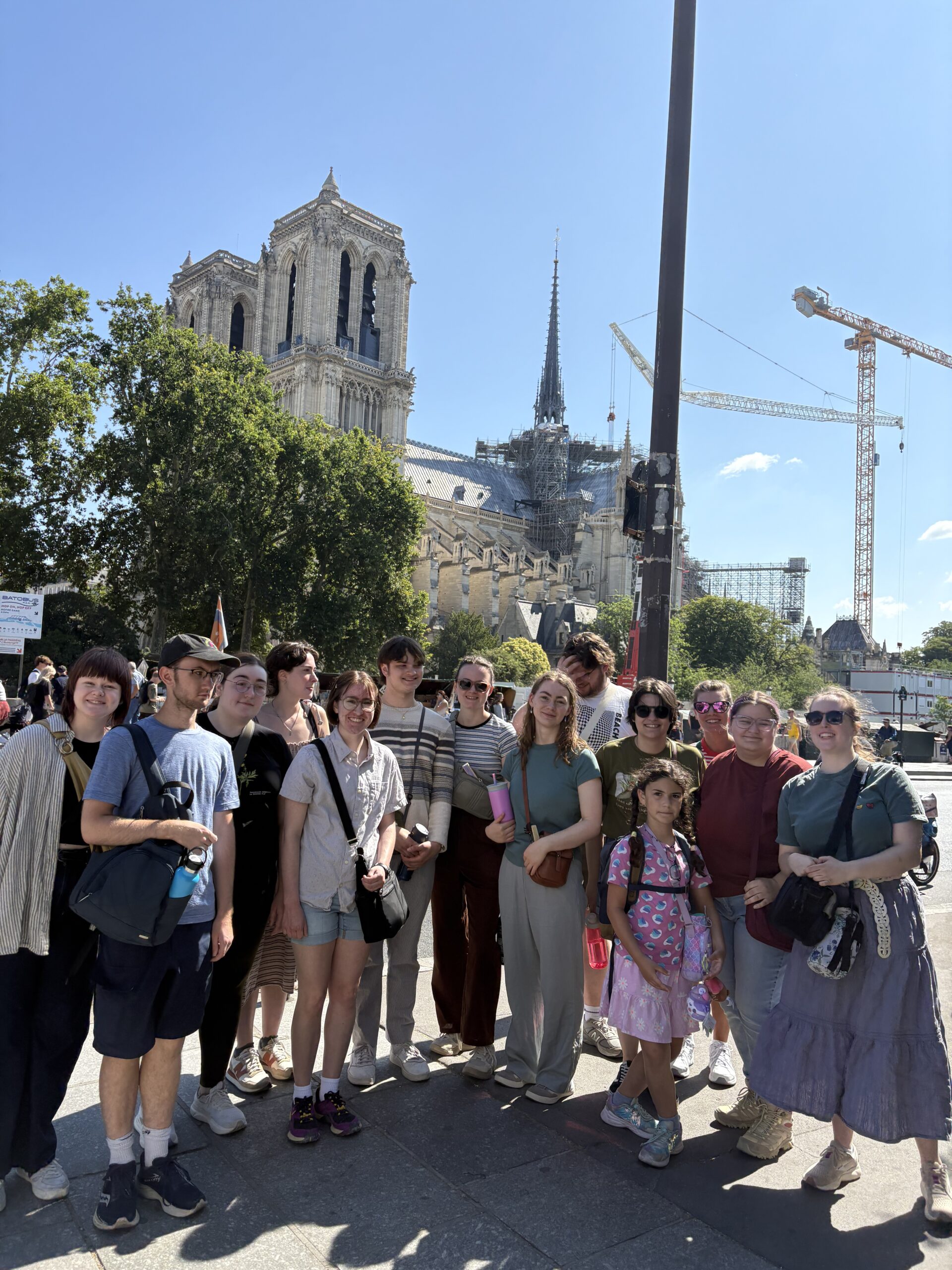
Meanwhile, Ellis Island had enormous importance in American History while the Île St Louis belonged to the church for centuries and then developed as residences for the rich. It’s very pleasant to visit but central to French history it is not.
Needless to say, I did not buy this poster. Though I must admit that it did what it set out to do, which is make me think about the ways the comparison is flawed. How about you, can you point to issues with this poster? Let me know in the comments!
Ugh, I keep coming up with other things I hate about the map. Why is the Eiffel Tower compared to the Empire State Building? Shouldn’t it be the Statue of Liberty? Eiffel designed the structure of both of them! They’re from the same time period! They’re both structures rather than buildings! OK, I gotta stop. I’m just making myself angrier.
* I don’t actually think I’m being unreasonable.